
How would the NBA season have finished?
I recently read Basketball on Paper by Dean Oliver. In this book he, presents a formula for expected winning percentage. Given that we’re in such a weird situation with the current basketball season, I wanted to see what that formula would have to say about how things are shaking out.
Using the formula for expected win percentage, we can examine how we would have expected teams to finish the season. With this, we can look at how it compares to a) teams included in the bubble, b) how teams finish the first round of the bubble season before the playoffs start.
There are more sophisticated ways to predict wins but I was interested to see how this performed, and a basical formula like this is always a good benchmark.
Setup
First we’ll download and do some processing of the data1:
library(tidyverse)
# remotes::install_github("jtcies/jtcr")
library(jtcr)
library(lubridate)
library(ggrepel)
library(scales)

theme_set(theme_jtc())

box_scores <- read_csv("https://raw.githubusercontent.com/jtcies/jtcies_site/master/content/data/nba-boxscores-2020.csv") %>%
    rename(game_id = X1) %>%
    distinct(game_id, .keep_all = TRUE)

box_scores_processed <- box_scores %>%
    mutate(
        winner = tolower(winner),
        home_team = if_else(winner == "home", winning_abbr, losing_abbr),
        away_team = if_else(winner == "away", winning_abbr, losing_abbr)
    )

tidy_box_scores <- function(dat, home_away) {

    type <- home_away
    dat$win <- ifelse(dat$winner == type, 1L, 0L)
    if (home_away == "home") {
        pa <- dat$away_points
    } else {
        pa <- dat$away_points
    }
    dat <- dplyr::select(dat, game_id, win, pace, starts_with(type))
    orig <- names(dat)
    new <- str_remove(orig, "home_|away_")
    names(dat) <- new
    dat$type <- type
    dat$home <- as.integer(as.factor(dat$type))
    dat$points_allowed <- pa
    dat

}

box_scores_tidy <- bind_rows(
    tidy_box_scores(box_scores_processed, "home"),
    tidy_box_scores(box_scores_processed, "away")
)
Calculating expected win percentage
The formula for win percentage he presents is this:
\[ P = \mathcal{N}\frac{ORtg - DRtg}{\sqrt{(var(ORtg) + var(DRtg) - 2 * cov(ORtg, DRtg)}} \]
where \(ORtg\) is team offensive rating, \(DRtg\) is team defensive rating, \(var(ORtg)\) is variance of team offensive rating (similarly for defensive rating), and \(cov(ORtg, DRtg)\) is the covariance between offensive and defensive rating.
So for each team that looks like:
calc_win_pct <- function(ortg, drtg) {

    mean_o <- mean(ortg)
    mean_d <- mean(drtg)
    var_o <- var(ortg)
    var_d <- var(drtg)
    cov_od <- cov(ortg, drtg)

    pnorm((mean_o - mean_d) / sqrt(var_o + var_d - (2 * cov_od)))
}

predicted_wins <- box_scores_tidy %>%
    group_by(team) %>%
    summarise(
        win_pct_calc = calc_win_pct(offensive_rating, defensive_rating),
        win_pct_actual = mean(win),
        wins = sum(win))

predicted_wins %>%
    ggplot(aes(win_pct_calc, win_pct_actual, label = team, color = team)) +
        geom_abline(lty = 2) +
        geom_point() +
        geom_text_repel() +
        scale_y_continuous(labels = scales::percent) +
        scale_x_continuous(labels = scales::percent) +
        theme(legend.position = "none") +
        labs(x = "Expected win percentage",
             y = "Actual win percentage",
             title = "Comparing expected and actual win percentage",
             subtitle = "Using Dean Oliver's formula in 'Basketball on Paper'")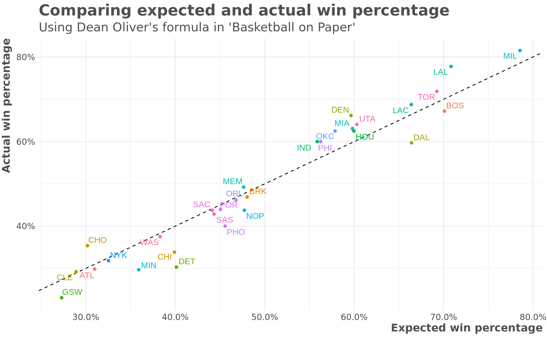
You can see that the formula has some regression to the mean built in with the better teams have a lower expected win percentage than actual and the worse teams having a higher expected win percentage than actual.
How would we expect teams to finish?
Using this calculation, we can look at how a team’s rank compared to their actual current rankings. This is interesting because current records were used to make decisions about which teams were included in the season restart.
east_teams <- c("ATL", "BOS", "BRK", "CHI", "CHO", "CLE", "DET", "IND",
                "MIA", "MIL", "NYK", "ORL", "PHI", "TOR", "WAS")

predicted_wins %>%
    mutate(conference = if_else(team %in% east_teams, "East", "West")) %>%
    group_by(conference) %>%
    select(team, conference, win_pct_calc, win_pct_actual) %>%
    gather(type, pct, win_pct_calc:win_pct_actual) %>%
    mutate(type = fct_rev(type)) %>%
    ggplot(aes(type, pct, color = team, group = team)) +
        geom_point() +
        geom_line() +
        facet_wrap(~ conference) +
        geom_text_repel(aes(label = team)) +
        scale_y_continuous(labels = scales::percent) +
        scale_x_discrete(labels = c("Expected", "Actual")) +
        theme(legend.position = "none") +
        labs(x = "",
             y = "Win Percentage")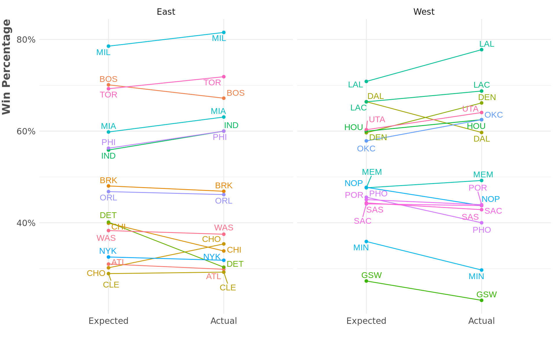
A few things stand out:
Top of East: Many basketball commentators think that 2nd place in the East is really a toss up between Toronto and Boston. We know that Boston was on a hot streak right before the season was paused. While Toronto had a better regular-season record so far, this formula gives the slight edge to Boston for the second spot (although it doesn’t say anything about how they would match-up in a playoff series).
Top of West: The thing that really stands out here is Dallas. The predicted win perctange gives Dallas a much better record than their actual record. More on this below.
Bottom of East: Almost everyone agrees (or at least they did before all of Brooklyn’s starting 5 turned over completely) that Washington had no buisness playing more basketball this year. And while there’s still a large gap between the 8th and 9th spots, the predicted win percentage actually has Chicago and Detroit above Washington.
Bottom of West: Similarly here, everyone thinks Phoenix is the outlier. And even though it will be almost impossible for them to get into the playoffs, from a predicted win percentage standpoint, they are much more in the mix than their actual record would suggest.
Dallas really stands out in the ‘should have won more games’ category. The plot below shows each team’s average offensive and defensive rating.
rating_averages <- box_scores_tidy %>%
    group_by(team) %>%
    summarise(
        offensive_rating = mean(offensive_rating),
        defensive_rating = mean(defensive_rating)
    )

rating_averages %>%
    ggplot(aes(defensive_rating, offensive_rating, color = team)) +
        geom_point() +
        geom_text_repel(aes(label = team)) +
        geom_vline(xintercept = mean(rating_averages$defensive_rating),
                   lty = 2) +
        geom_hline(yintercept = mean(rating_averages$offensive_rating),
                   lty = 2) +
        theme(legend.position = "none") +
        labs(x = "Average defensive rating",
             y = "Average offensive rating",
             title = "Dallas has highest offensive rating by far",
             subtitle = "dashed lines show average ratings")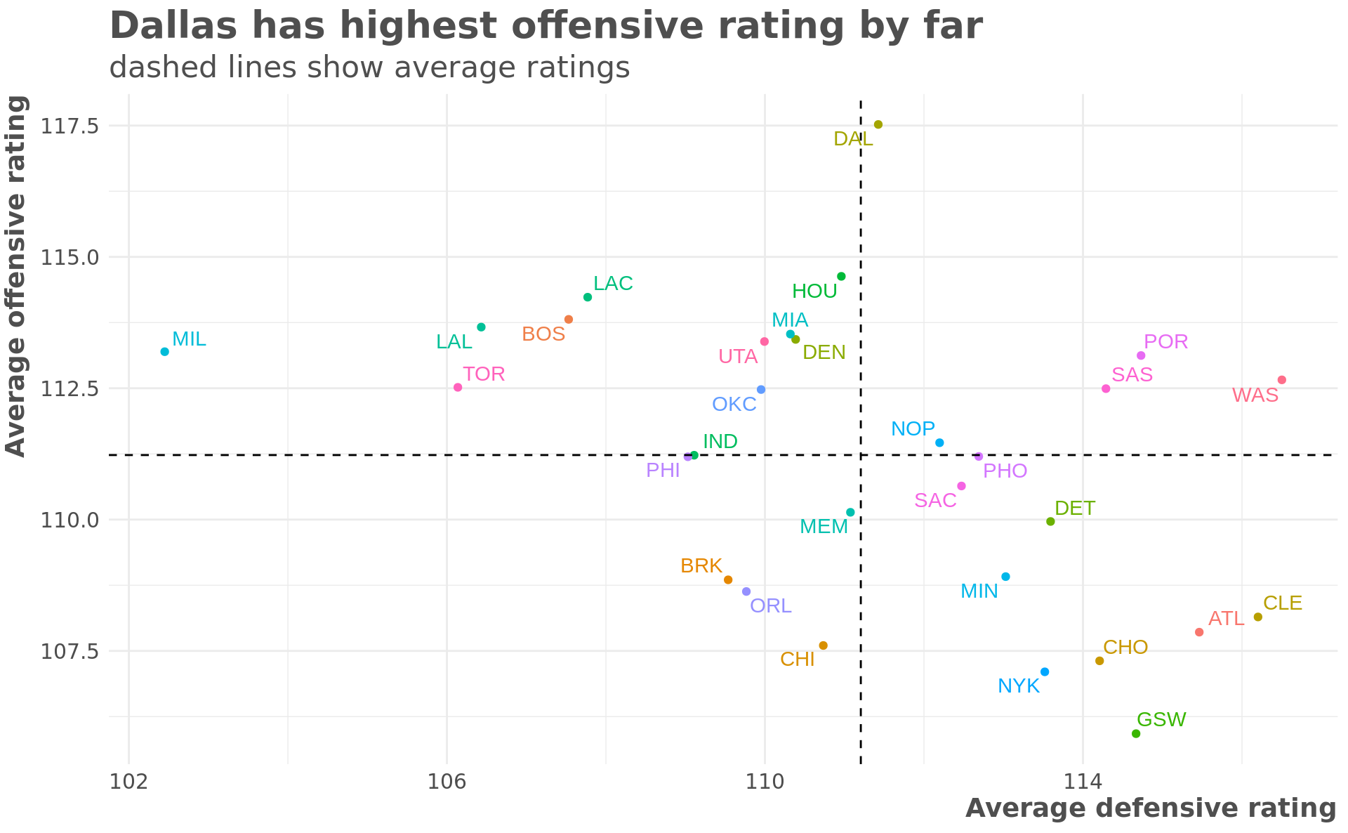
Dallas has by far the best average offensive rating. The rest of the best teams in the league (Lakers, Clippers, Boston, Toronto, and especially Milwaukee) all have very low defensive ratings. The formula appears to value offense over defense, which may be why most of those teams have a lower expected win percentage than actual. This is also why the model thinks Boston is better than Toronto.
Conclusion
There are clear limitations in using a formula like this. It might help describe the historical distrubtion but it’s not terribly predictive. However,I think it is useful to start with a relatively straightforward, easy to interpret model, and see what insights it can reveal before moving to something more complicated.
